



420CBDS — THE CBD COMPANY · EST. 2020
Pure typography
A typographic identity for 420CBDS, a CBD company. Inspired by the strong minimalism of Asian design, the logo drops any symbol and is built entirely on the 4/20 concept, a reference to the international date.
It works with or without secondary text, which makes it easy to apply anywhere.


Pantone® Neutral Black C
C86 M76 Y59 K88
#0E0F13
Pantone® 626 CP
C80 M18 Y56 K54
#00594C
— The 4/20 concept
The whole logo grows from 4/20, giving the brand an instant, memorable reference.
— Neutral Black and Pantone 626 CP
Neutral black brings sophistication and elegance; PANTONE 626 CP adds warmth and energy.
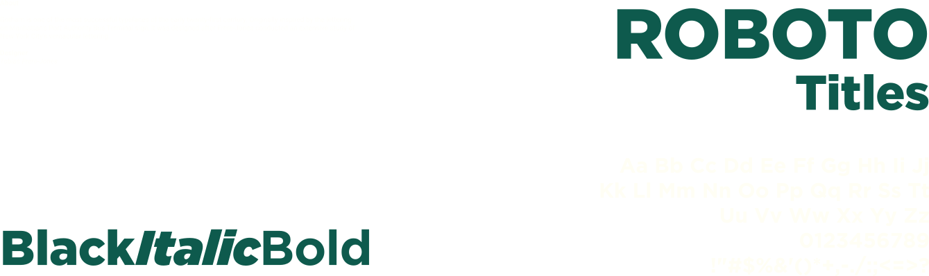
— Roboto
A clean, modern typeface that keeps the system simple and highly legible.

Project sheet
The client
A CBD company established in 2020.
Deliverables
- StrategyPure typography, no symbol, built on 4/20
- Verbal identityTHE CBD COMPANY · EST. 2020 and a straight, confident tone
- Visual identityTypographic logo with and without secondary text, Roboto, Neutral Black and Pantone 626 CP
- ApplicationsBrand applications and 3D mock-ups
- Brand guidelinesLogo versions, clear space and colour use
My mission
A purely typographic identity built on the 4/20 concept, with no symbol.