
EL TABURETE — SEVILLE NEIGHBOURHOOD BAR
A neighbourhood classic, updated without losing what made it recognisable.
El Taburete is a Seville neighbourhood bar of the old kind: a counter, tapas and orders written in chalk. The challenge was to update it without losing what made it recognisable.
Nitrato
RGB 16 · 24 · 32
C50 M25 Y0 K88
#101820
Cal
RGB 255 · 249 · 246
C0 M3 Y4 K0
#FFF9F6
Olivo
RGB 80 · 104 · 93
C23 M0 Y11 K59
#50685D
⸺ The floor became the symbol
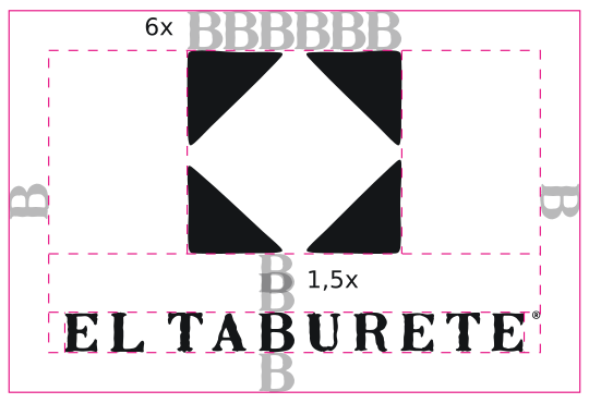
The isotype comes from an element of the bar itself: its floor tile. Its geometry gives four triangles whose negative space draws a stool seen from above.
⸺ Name and floor, one shape
The isotype is the bar’s name made visible. El Taburete and its floor end up being the same form.
⸺ A hand-drawn logotype
The logotype was drawn by hand, letter by letter, inspired by the ceramic street signs of Seville.
⸺ Bitter: the familiar voice
A slab serif for the voice of always.
⸺ Work Sans: the everyday
A humanist sans for everything functional and current.
⸺ Olivo, Nitrato and Cal
The palette is reduced to three colours, all rooted in the landscape.
From the façade to the apron
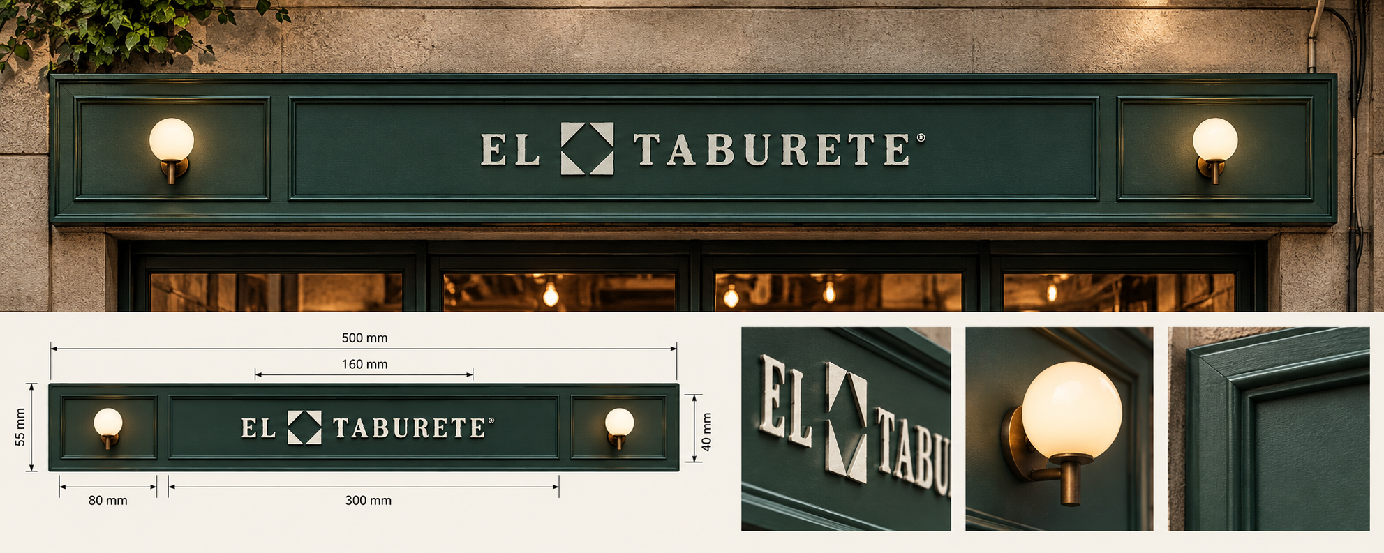
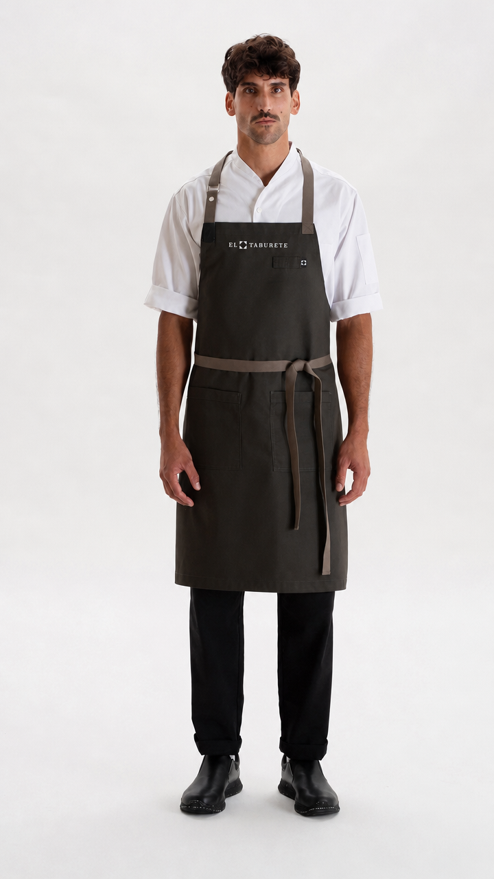
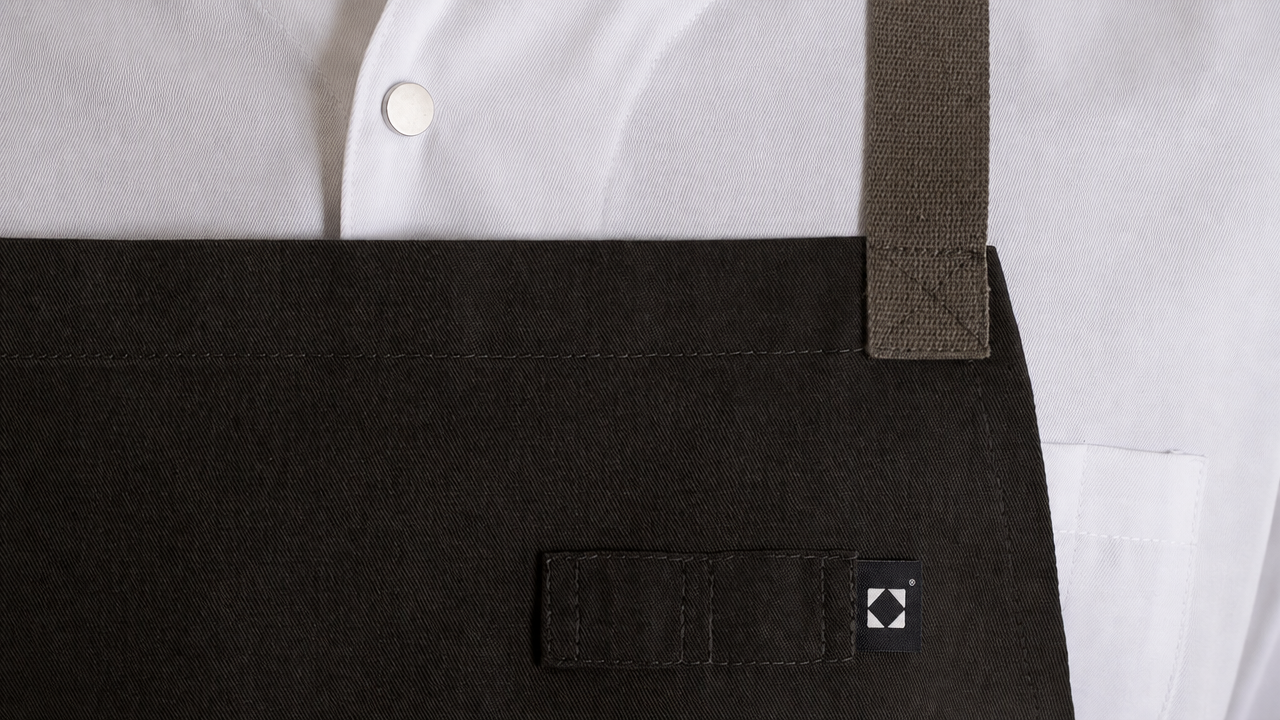
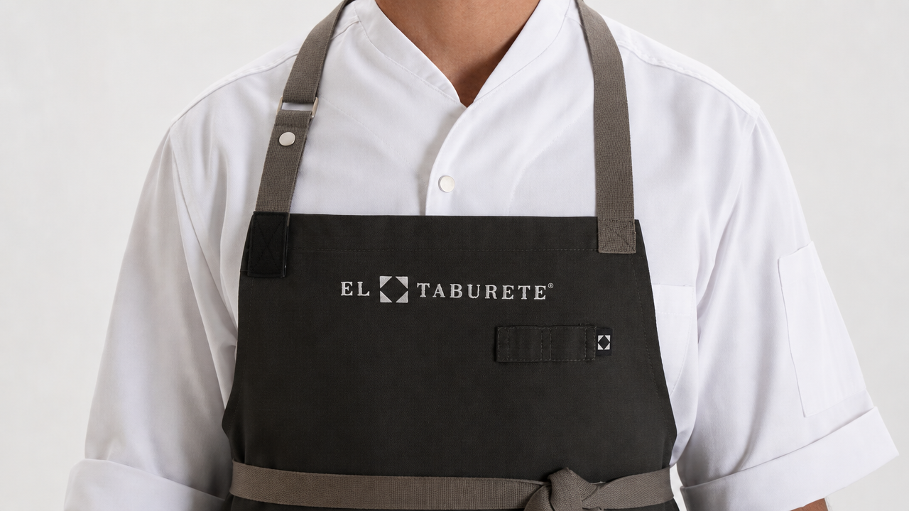
The identity comes to life on the storefront, with the logotype in relief on an olive-green fascia framed by two globe lamps, and on the team’s aprons, where a small isotype label on the pocket repeats the mark.
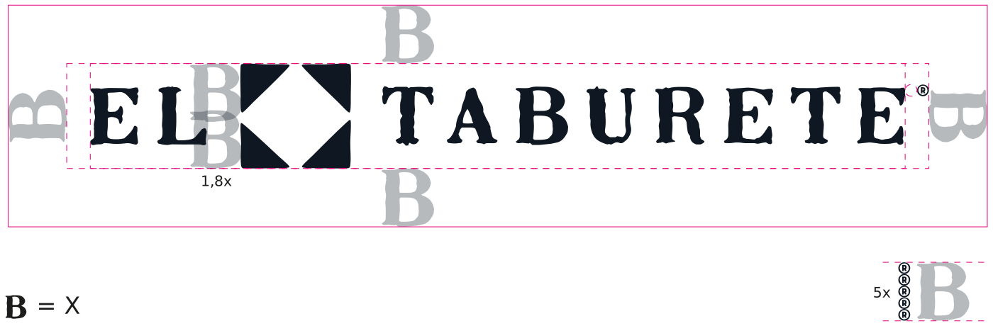
A construction grid and clear-space rules, with the letter B as the unit of measure, keep the logotype and the isotype consistent at every size, from signage to textile.